
Adding Tabular Data into Responsive XMS Systems
How to add and format Tabular Data in XMS Systems while making sure it is still responsive and visible on any device the user might use to view my website
To use tables or not…? That’s the question…
Using tables for layout of your information is usually frowned upon. However in some cases there is good reason for using tables to force thing to look they way you want them to look.
One of these cases is when you need to display rows of information that need to be presented in columns like test results, or conversion tables.
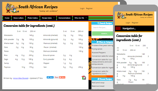
Imaged below is a good example when and why your should use tables. In this example the user aligned the vertical columns using blank spaces. Initially it looks good until yhe view port gets smaller...
The video explains why it is a bad idea to try and make things look nice by using blank spaces to align things and then show you how to do it properly and a couple of “tips and tricks” while you using your table.
You are able to use tables in any location where you can edit content and have the appropriate template available.
My table is to wide.
A problem you might run into is if your data is to wide for the view port and half the tabular data is cut off or not displaying properly. This will most probably happen if you chose not to tuse the template or you changed over to “Source” mode to paste a table into the page.
The easiest way to fix this problem and have it show properly on a mobile device is to manually add two line of “code” while in the “Source” mode.
You will nee to create an extra “div” the wraps your table and assign a class “wide_table” to it.
Your code should look something like the following. The two lines of code is highlighted in red.
<div class="wide_table"> <table border="0" cellpadding="1" cellspacing="1" style="width:100%;"> <tbody> <tr> <td> </td> <td> </td> </tr> <tr> <td> </td> <td> </td> </tr> <tr> <td> </td> <td> </td> </tr> </tbody> </table> </div>
This will automatically add a horizontal scroll bar at the bottom of the page to allow your viewer to scroll left and right to view all the information.