
XMS Systems Responsive Layout explained
This article attempt to explain the logics behind the XMS Responsive grid system. Why it does that and how it works.
XMS Systems has been completely re-build over the last couple of months and are nearing the first official release in it's new form.
The biggest change was to make XMS Systems truly "responsive" and with a "mobile first" approach.
Gone are the days that your site visitor had to scroll left and right or "double tap" the screen to zoom in to be able to read your content. Biggest positive point is that there are no need for separate "mobile" websites any more. One website does it all!
This means that your website will display properly on any device, no matter how wide the actual "view port" is. Below is a screen shot made with a tool provided by Google called "Resizer"

The answer is a "Responsive Grid Layout"
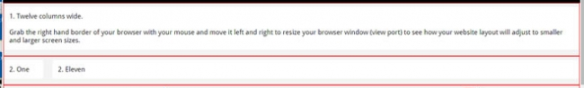
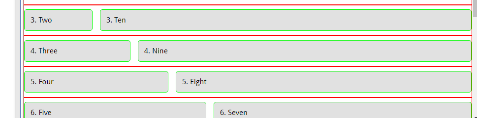
Your page is divided into as many rows as you want with 12 vertical vertical columns inside each row. You can combine columns in a row to make wider content blocks as long as the total number of columns always adds up to exactly 12 columns.
In this demonstration page on out development and demonstration website you can visually see how it works. We have outlined each row with a red line. Resize the page width smaller and wider to see how the rows and columns react to the screen size.
To get technical...
The html programming looks something like this. Code is colourized to make it easier to follow.
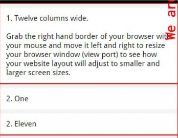
<div class="row">
        <div class="twelve columns">
            <p>1. Twelve columns wide</p>
        </div>
</div>
<div class="row">
        <div class="one column">
              <p>2. One</p>
        </div>
        <div class="eleven columns">
              <p>2. Eleven</p>
        </div>
</div>
The above will produce the first two "rows" on the demo page.
- Desktop View
- Mobile View
To make it easier for you to get started we generated a couple of templated to choose from.
Inside your content editor click the "template" icon

Then select the template from the list to insert the selected template into your editor.

To add more "rows" hover your mouse where you want to add the row, click the red block and follow the above procedure.
After upgrading a couple of XMS Systems based websites we realised that things can get a bit confusing at times when editing the content.
We listened and made a change to the backed so that you can easily identify the rows and columns in your content.
All rows will now hev red borders around them and columns will have a green border.
The video demonstrates a simple page configuration.
To get a page to look like the demonstration site home page requires a bit more XMS Magic that is outside the scope of this article.
The page we created can be viewed here