Back to Fred Mac Donald's Blog

How to make responsive data tables with CSS only
Short discussion and example of using css and media queries to render a data table responsive.
Tabular data and the modern day “mobile first” approach is a nightmare to say the least.
Below is an example of how to use css and media queries to get your tables responsive. The drawback is that you will need a set of css code like this for each table you use because you need to define the table headings that needs to be used.
Simply add class="resp" to your table to activate.
/*
Max width before this PARTICULAR table gets nasty
This query will take effect for any screen smaller than 760px
and also iPads specifically.
*/
@media
only screen and (max-width: 760px),
(min-device-width: 768px) and (max-device-width: 1024px)  {
    /* Force table to not be like tables anymore */
    .resp table, .resp thead, .resp tbody, .resp th, .resp td, .resp tr {
        display: block;
    }

    /* Hide table headers (but not display: none;, for accessibility) */
    thead tr {
        position: absolute;
        top: -9999px;
        left: -9999px;
    }

    tr { border: 1px solid #ccc; }

    td {
        /* Behave  like a "row" */
        border: none;
        border-bottom: 1px solid #eee;
        position: relative;
        padding-left: 50%;
    }

    td:before {
        /* Now like a table header */
        position: absolute;
        /* Top/left values mimic padding */
        top: 6px;
        left: 6px;
        width: 45%;
        padding-right: 10px;
        white-space: nowrap;
    }

    /*
    Label the data
    */
    td:nth-of-type(1):before { content: "Heding 2"; }
    td:nth-of-type(2):before { content: "Heding 3"; }
    td:nth-of-type(3):before { content: "Heding 4"; }
    td:nth-of-type(4):before { content: "Heding 5"; }
    td:nth-of-type(5):before { content: "Heding 6"; }
    td:nth-of-type(6):before { content: "Heding 7"; }
    td:nth-of-type(7):before { content: "Heding 8"; }
    td:nth-of-type(8):before { content: "Heding 9"; }
    td:nth-of-type(9):before { content: "Heding 10"; }
    td:nth-of-type(10):before { content: "Heding 11"; }
    td:nth-of-type(11):before { content: "Heding 12"; }
    td:nth-of-type(12):before { content: "Heding 13"; }
    td:nth-of-type(13):before { content: "Heding 14"; }
    td:nth-of-type(14):before { content: "Heding 15"; }
    td:nth-of-type(15):before { content: "Heding 16"; }
    td:nth-of-type(16):before { content: "Heding 17"; }
}
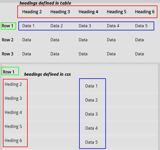
This is not very efficient but if you going to use tables then you pretty much stuck with this.
Looking at this example here you can see it in practise. The example also makes use of another method combining css and jquery.
https://www.leadingwebexposure.com/page-216-responsive-tables.html
If you are using XMS Systems as your content manager you have the option to add this code to a page and customise it when required.