
XMS Systems Style Sheet Cheat Sheet
A summary of styles and CSS "scripts" you can use in XMS Systems.
Add one or a combination of the following CSS Styles to your div. Be careful to ensure there is a space between the existing style and what you want to enter. Also note that the words are case sensitive and needs to be 100% correctly spelled.
This is targeted at the more advanced user that are brave enough to click the “Source” button on the editor.
For the rest, just drop us a support ticket the ask for help.
How to use the classes.
e.g. you might see something like this in your code to tell the browser to display the text as a Heading Level 5
<h5>This is a heading level 5</h5>
Changing it as follows:
<h5 class=”txt_shadow”>This is a heading level 5</h5>
will add a drop down shadow to the text.
This is a heading level 5
Standard classes
- default_custom_div
the standard background of your content - thumbs
to style images to make them responsive - warning_div
block with a light red background - txt_shadow
add a drop shadow to your text - show_pointer
replace mouse pointer with a pointing finger on hover - wide_div1
stretches the width of the background to the maximum of the viewport, each can be styled to different heights and backgrounds - wide_div2
- wide_div3
- wide_div4
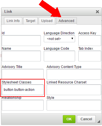
Style links as Buttons
On the screen where you enter the link, click “Advanced” and enter the classes you want in the “Stylesheet Classes” field
or if you adventurous try the following:
A normal link would look like this Test Link and the code would look like this
<a href=”some_pahe.php”>Test Link</a>
To make this look like a button edit the code as follows
<a class=”button button-action” href=”some_pahe.php”>Test Link</a>
will give make it look like this Test Link
- button-danger
- button-warning
- button-ok
- button-bread
- button-black
- button-action
- button-primary
- button-submit
Note: Your buttons could be styled a different colour
Special Function
- offset-by-[n]
if you need to centre a column (e.g. six columns wide) in your grid without using 2 empty “three columns” on either side you can use this class and replace the [n] with the number of empty column on either side of you centred column
e.g. class=”offset-by-three six columns” will give you a six column block centred in the row with a three column space to the left and right of it. - embed
- tmp
add this to your element to have it draw a red line around it to visually see where the div or other element ends - big_link
Add this to expand link to the parent div. This will allow your visitor to click anywhere inside the div instead of directly on the link - same_height
Add this class to all the columns inside a row to display them as equal heights - wide_table
to add information in table format and ensure it is always visible regardless of the width of the viewport first add a div with a class of “wide_table then add your table inside the div. This class will add a horizontal scroll bar below the table if the table is wider than the viewport - hide_this
hide item if view-port smaller than 800px - show_this
show item if view-port smaller than 800px - div_overlay
use this to add a title to an image as an overlay. To use this you will create a div around the image, followed by a div inside the same div with this class.
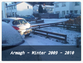
<div>
  <img alt="Alt info to the image" class="thumbs" src="/media/image/winter_photo.jpg"/>
     <div class="div_overlay">
        <h5>Armagh – Winter 2009 – 2010</h5>
     </div>
</div>
pre and code tags will be generated if you add a style “formatted” from the editor dropdown and style the selected text like this
Carousel/Sliders
A new version of the “Owl Carousel” is being pushed out to all websites from February 2018. This will significantly reduce page load time and make more possibilities available to play with animations.
The following class is used to initialise the carousel, set navigation dots and centre everything (if needed)
class=”owl-carousel owl-theme u-center”
The following id’s are used to display the default included sliders.
- id="default_owl"
- id="loop_owl"
- id="owl_carousel_shop"
To add a carousel in your content is discussed in the Adding a Carousel to your Content article.
Layout
- valign-middle
this will align everything in a div/row vertically and horizontally - valign-vertical
this will align everything in a div/row vertically - u-full-width
this class will stretch a button to the full width if the column. Useful to style for a mobile device - u-max-full-width
this class will stretch a button to the full width if the column. Useful to style for a mobile device - u-pull-right
- u-pull-left
- u-center
add this class to center everything in a div instead of clicking the “Center Align” button on each paragraph
CSS Animations
If we want to have some animation on our heading to draw attention to it we can update the class as follows
<h5 class=”txt_shadow animated bounce infinite”>This is a heading level 5</h5>
to make the div bounce. By adding infinite to the class the animation will repeat.
This is a heading level 5
Animations Delay
Adding one of the following will delay the animation on page load. Using these you can have elements on your page “slide” in or out after up to 5 seconds after the page loaded.
- delay_1_sec
- delay_2_sec
- delay_3_sec
- delay_4_sec
- delay_5_sec
Animations Attention Seekers
- bounce
- flash
- pulse
- rubberBand
- shake
- swing
- tada
- wobble
- jello
Animations Bouncing Entrances
- bounceIn
- bouncehInDown
- bounceInLeft
- bounceInRight
- bounceInUp
Animation Bouncing Exits
- bounceOut
- bounceOutDown
- bounceOutLeft
- bounceOutUp
Animation Fading Entrances
- fadeInDown
- fadeInDownBig
- fadeInLeft
- fadeInLeftBig
- fadeInRight
- fadeInRightBig
- fadeUp
- fadeUpBig
Animation Fading Exits
- fadeOut
- fadeOutDown
- fadeOutDownBig
- fadeOutLeft
- fadeOutLeftBig
- fadeOutRight
- fadeOutRightBig
- fadeOutUp
- fadeOutUpBig
Animation Flippers
- flip
- flipInX
- flipInY
- flipOutX
- flipOutY
Animation Lightspeed
- lightSpeedIn
- lightSpeedOut
Animation Rotating Entrances
- rotateIn
- rotateInDownLeft
- rotateInDownRight
- rotateInUpLeft
- rotateInUpRight
Animate Rotating Exits
- rotateOut
- rotateOutDownLeft
- rotateOutDownRight
- rotateOutUpLeft
- rotateOutUpRight
Animate Sliding Entrances
- slideInUp
- slideInDown
- slideInLeft
- slideInRight
Animate Sliding Exits
- slideOutUp
- slideOutDown
- slideOutLeft
- slideOutRight
Animate Zoom Entrances
- zoomIn
- zoomInDown
- zoomInLeft
- zoomInRight
- zoomInUp
Animate Zoom Exits
- zoomOut
- zoomOutDown
- zoomOutLeft
- zoomOutRight
- zoomOutUp
Animate Specials
- hinge
- rollIn
- rollOut
For animation preview click here
Icons
A complete set of icons can be used by applying them as classes using the integrated “Font Awesome” iconset.
See the complete list of icons here directly at Font Awesome
Note: Using these in your text editor might be problematic because the “classes” might be stripped out from your content when you edit your content a second time.
How to use?
<h5><span class="fa fa-buysellads"></span> Test</h5>
Note: Using these in your text editor might be problematic because the “classes” might be stripped out from your content when you edit your content a second time.